LondonArtGirl

LondonArtGirl has moved to her own domain. Check her out at her new website at www.londonartgirl.com for more comprehensive posts, opinions, and reviews. See you there!

14 March 2007

LondonArtGirl has moved to her own domain!

Please come join us over at our new address:

www.londonartgirl.com

Same stuff...different place. See you there.

08 March 2007

'Sugar' by Kent Christensen at Eleven Gallery


Over the past year, I’ve walked by Eleven Gallery many times without ever stepping through the front door. Located in the outskirts of Chelsea, the modest space is unassuming from the outside and a little off the gallery-hopping path. However, once inside, I soon discovered that this is my type of gallery. Not too big or too pretentious, Eleven Gallery showcases contemporary and emerging artists without the requisite attitude and extortionate prices so common in today’s art market. Moreover, I really like the majority of the artists they represent – a major bonus in my book.

As a lifelong fan of Wayne Thiebaud’s appetising depictions of food and sweets, I was easily drawn into Kent Christensen’s world. When you walk into the gallery, you are instantly surrounded by delicious and tempting treats skilfully depicted on the 20 small to medium sized canvases. However, there is more here than meets the eye. The artist uses mundane objects such as candy and baked goods to put forth a discussion on numerous topics such as gluttony, the obesity epidemic, high-art versus low-art, and art historical references. What I like about this show is that it offers the viewer some choices in respect to how they want to interact with the artwork. On the superficial level, the decorative pictures evoke feelings of nostalgia, comfort, and cravings. One could be fully satisfied with the canvases if they wanted to leave their experience at this point. But if the viewer goes deeper and uses a critical and art historical eye, they can almost hear the artist speaking to them about the serious and more thoughtful issues at play in the works. Like most things, the more you put into these works, the more you take away from them. There are some stand out pieces in this show such as “Ribbon Candy in a Tall Glass Vase”, “Cupcake”, “Macaroons”, and “The Green Jell-o” – all at attainable and collectible prices.

Cleverly, the gallery has a bowl of candy in the front window. I wonder how many people dip into that on their way out? Check out Sugar at Eleven Gallery before time runs out. www.elevenfineart.com

06 November 2006

Julian Opie at Alan Cristea Gallery


Walking Dancing Dressing Smoking

Is it okay to like a piece of art simply because it is cool? I think so. However, I have many acquaintances that wouldn’t dare describe art as cool, let alone admit that it was a reason they liked the piece. I think it is important to talk about art historical references, technique, and provenance, but sometimes I am drawn to something simply because it is cool. Well, Julian Opie may be where these two schools of thought meet. Using modern methods to reinterpret classical subjects, Britain’s leading figure in computerized art may have found a way to satisfy art history snobs and casual viewers alike.

In his current exhibition ‘Walking Dancing Dressing Smoking’, Julian Opie uses classical motifs, such as portraits and nudes, and puts his own spin on them. With his minimalist style, Opie strips away the complexities of his subjects by representing objects and figures in their most basic form. It is not uncommon to see heads floating above bodies, heavily outlined figures, and a lack of three-dimensionality in his work. This show is no different. Interesting and engaging from beginning to end, mere description cannot do these pieces justice. The exhibition is on until mid-November so hurry down to Alan Cristea Gallery on Cork Street and check out a little slice of cool in central London.

31 October 2006

Robert Polidori at Flowers East


Let me start out by saying that Flowers East is one of my favorite gallery spaces in London. Set over two floors, the space is large and airy, with copious amounts of wall space to showcase the artwork. The staff is consistently friendly and helpful, which LAG always appreciates while gallery hopping. If you haven’t visited the space yet, I highly recommend that you swing by on your next outing to the east end. Now let’s get to the artwork.

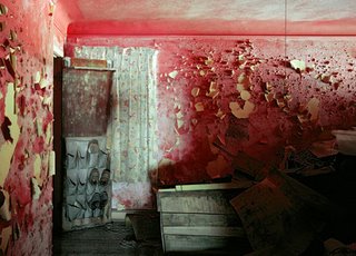
Currently showing at Flowers East is an exhibition of Robert Polidori's photographs of the aftermath of Hurricane Katrina in New Orleans. What I first noticed in the large, richly colored photographs was the amazing light that Polidori is able to capture. The pictures are beautiful despite the devastation that they display. Devoid of any human figures, each work contributes to a larger narrative of loss and destruction. We see paint peeling off walls, refrigerators on their side, cars overturned, and personal belongings covered in dirt and mold. All completely destroyed. Polidori shows the viewer a ghost town comprised of loss and ruin. We are left with traces of a life that no longer exists as it once did before the hurricane.

Polidori's images are surreal. Is this due to the artist’s exquisite skill or the strong desire for the images not to be real? For me, I think it is a little bit of both. Check out Robert Polidari at Flowers East until 12 November 2006. www.flowerseast.com

Jonathan Wateridge at David Risley Gallery


On a clear day you can see forever

I have been reading a lot about this particular exhibition over the past couple of weeks. Words like ‘amazing’, ‘fabulous’, and ‘breath-taking’ were being thrown around in regards to Jonathan Wateridge’s first solo show. Looking at the images on the web, I have to admit that I was intrigued by the disaster theme. So last Friday, I bundled up and made my way to the home of contemporary art in London…the east end.

David Risley Gallery is tucked away on Vyner Street with a front door that even I had to duck to get through. Once inside the gallery, I completely understood what everyone was talking about. Each of the large four works is hung on its own wall, preventing any distractions to the viewer. Set against unspecific, yet extremely intense landscapes, each work depicts shipwrecks and airplane crashes. The artist does not provide any clues as to what happened in each scene. The machines are not of the modern age and the backgrounds are generic. The truly noteworthy aspect to these disaster scenes is in the artist’s construction. The works are done in oil on large sheets of perspex (acrylic glass) that is built up over ten layers. The result is a three dimensional image that is reminiscent of a stage set, providing a very dramatic and theatrical feeling.

The show is already sold out but that doesn’t mean that you can’t go down to the gallery and enjoy the view. Take my word: these are definitely worth the trip. Check out Jonathan Wateridge’s work at the David Risley Gallery until 19 November 2006.

25 October 2006

Royal College of Art Painting Department Interim Show 2006

Today has been all about surprises for LondonArtGirl. It started off when I was surfing the web and found out that the Royal College of Art was having a student interim show. Now, if you are a loyal reader of LAG then you know how much I love student shows. They are the perfect opportunity to gauge future talent and formulate your own opinion before the critics and tastemakers have their say. The last couple of student shows I have visited were okay, but generally I wasn’t bowled over. However, this show was different. The quality of the work was consistently higher and there was simply more of it.

Now here comes the bad part. Perhaps indicative of the current contemporary art market, the prices were rather…ahem… steep for a student show. Once upon a time, these shows were a great place for novice collectors to get their feet wet in the art market and for savvy collectors to get some great deals. Sadly, it appears these days are gone. More importantly, however, the talent is still here. Here are some of the works that caught my eye.


The first work I saw in the front room was a large canvas titled “Take Me Madonna” by Simon Collins. You need to take your time with this one because there is a lot going on here. The work is expertly rendered in a realist style – although I don’t know how likely you are to see this scene in reality. On the left side of the canvas, there is a bare-breasted woman seated with her legs partially open and her head arbitrarily cropped out of the composition. In the background there is a woman gazing warmly at something or someone that is not clear to the viewer. To the right is a masked man kneeling over a nun wearing only her habit and clutching a rosary. Both the nun and the masked man are staring out at the viewer as if to dare them to look at the provocative and sexually charged image. There is no shame in their eyes, only intensity. Perhaps that is what makes this work so engaging. Moving on…


What first caught my eye in Ryan Mosley’s “Understanding the Quarry” was his fluid use of brushstrokes and the earth tone palette. The triangular composition shows 6 figures donning dunce caps in the foreground watching a human pyramid assembled in front of them. The figures facing the viewer are expressive rather than realistic, with some facial features defined more than others. I would love to know the story behind the subject in order to truly understand the work. Fortunately I was still able to appreciate it, if only a purely aesthetic level. And finally…


Further back in the exhibit is a large canvas by Hannah Poulson titled “The Clearing”. The artist leaves much of the canvas's foreground exposed, including the trunks of the trees. From a distance, women appear to be randomly scattered and obscured by the forest. It is only on closer examination that the figures look like models straight out of a runway show. Wearing fashionable clothes and donning a forward-looking gaze, they look like they could walk right off the canvas and into a fashion catalogue. I love the way the artist chooses a simple representation of the forest to contrast the highly detailed depiction of the figures.

Regardless of your budget, hurry up and scoot down to the Royal College of Art to check out the artists of the future before the show closes!

24 October 2006

David Hockney Portraits at the National Portrait Gallery


Ah, autumn in London. The days get shorter and wetter. Having started to become depressed by the changing seasons and the inability to do anything outdoors, I headed over to the National Portrait Gallery to catch the “David Hockney Portraits” exhibition. I figured with his bright colors and Los Angeles influence, this was exactly what I needed to lift my spirits out of the seasonal doldrums. While I was expecting swimming pools and palm trees, much to my (pleasant) surprise, I found something so much deeper and intimate.

This is the first retrospective of Hockney’s work devoted solely to portraiture. The artwork was selected in collaboration with the artist, and features works executed in all media throughout his career. The show explores the artist’s relationships with friends, family, and people he admires. His deep understanding of the human condition and insight into his subjects’ lives is translated expertly onto the canvas. In some works, the viewer feels as if they are witnessing or even intruding on a private moment. This is especially evident in the many drawings of his closest friends and family. Even as his style evolves and he begins to experiment with new media such as photocollage, this theme remains constant throughout the exhibition. Ultimately, this collection offers an intimate access into the artist’s life through his works. There are too many noteworthy pieces to discuss, however, be sure to keep a look out for “Mr. and Mrs. Clark and Percy” and a small drawing of a fictional meeting between Hockney and Picasso entitled “Artist and Model”.

Even if a show dedicated to portraiture doesn’t sound like you cup of tea, escape from the rain and head over to the NPG – this is not to be missed. Check out “David Hockney Portraits” at the National Portrait Gallery until 21 January 2007.

23 October 2006

USA Today at the Royal Academy of Arts

If you are familiar with the London art world then you know super-collector and market maker Charles Saatchi. In 1998, his enthusiasm for the Young British Artists culminated in the much talked about and somewhat controversial show "Sensation". Currently, Mr. Saatchi is taking a similar interest in 40 young emerging artists and is showing their works at the Royal Academy of Arts. The exhibit, "USA Today", sets out to represent the current state of art making in the United States. The 80 works on display address social and political themes that are relevant not only in America, but also globally.

Even though the exhibition is spread out over two floors, I found the most interesting and noteworthy pieces to be located on the ground floor. On the left as you walk in, there are two large maps of America by French born artist Jules de Balincourt. Initially I was drawn to the works because of the bold color palette and the familiar shape of the American map. When I began to study the compositions more closely, it became clear that the artist was attempting to convey a larger message to the viewer. In "US World Studies II" & "US World Studies III", the artist uses naïve like depictions and bright colors to comment on social and political inequalities in America, as well as corporate greed. It is a thought provoking and engaging take on the domestic status of the superpower and how the rest of the world views the United States.

On the right of the staircase are two large landscape photographs by Florian Maier-Aichen. The artist uses strange angles, aerial views, and post-production enhancements to take images that seem familiar and comforting and manipulate them to appear foreign and anxiety laden. In "Untitled 2005", the serenity of a pristine beach and a long highway is shattered by the artificially red colored hillside on the right side of the photograph. What should be a serene image is transformed into a post-apocalyptic anxiety attack. Let’s just hope this is not Maier-Aichen’s view of the future of America. Regardless of the artist’s point of view, I found myself thinking about these works long after I left the exhibit – always a good sign in my book. Check out USA Today at the Royal Academy of Art until November 4th. www.royalacademy.org.uk

Add to Google